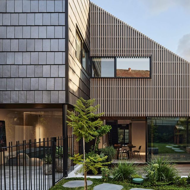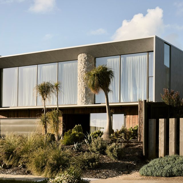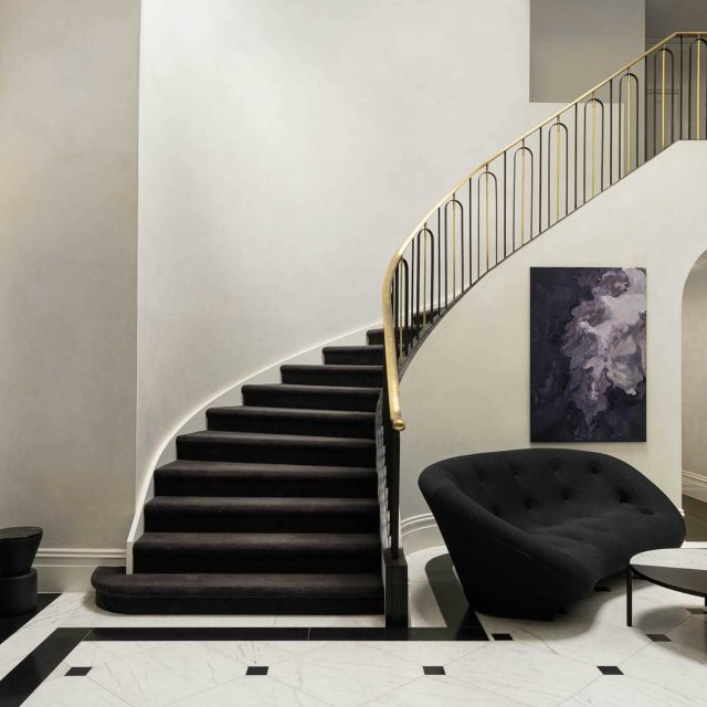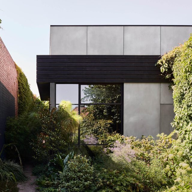
Casa Victoria is an exploration of design ideas inspired by the client, whose strong aesthetic sense and Mexican heritage are expressed in the approach to the restored workers cottage. Unifying two distant worlds, the design explores an overlaying of a traditional Mexican courtyard home on an inner Melbourne Victorian workers cottage, resulting in highly unique design detailing.
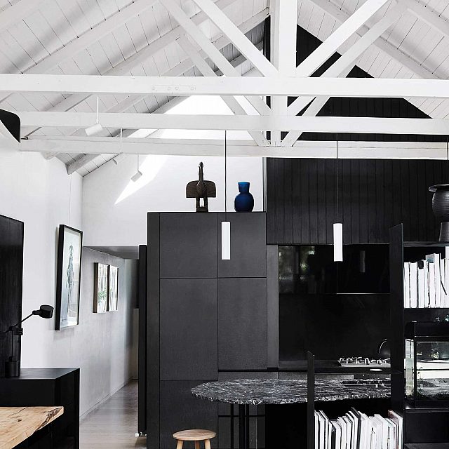
Like many traditional workers cottages, the existing home was limited by access to light and restricted by significant planning guidelines. In response, the compact home relies heavily on the implementation of a new curving roofline allowing north-westerly light to permeate the new addition, introducing a second level mezzanine to create a luxurious master bedroom and ensuite.
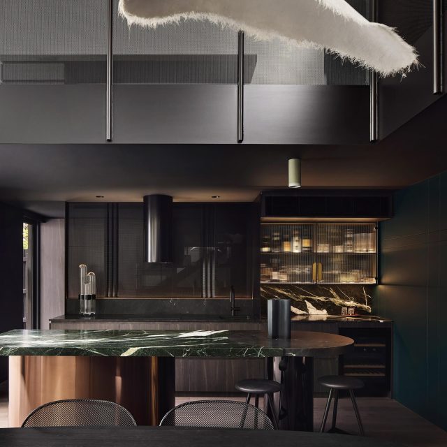
Benefiting from the additional ceiling height, the extension at the rear of the house creates a sculptural open living space and kitchen elevated by a rich material palate. Additionally, the back of the house encompasses a framed courtyard like garden, to extend the living room beyond its limits.
With a considered selection of raked plasters, recycled timbers, weathered stone and existing brick, a highly textured and hand worked aesthetic was amplified with dramatic natural and artificial lighting. Repetition is created using a subtle grid pattern layered into the kitchen, follows and blending into the rear garden.
Responding to the limitations of the architectural expansion, the architecture is highly focused on the interior design to cater the clients programmatic brief as well as to add sophistication to the home fostering a rich experiential quality.
The 4.5m wide, fully enclosed block determined a linear sequence of open plan spaces that utilise ceiling, top lighting and mirrors for definition, connection and spatial drama as an approach to modernising the front portion of the traditional home. The Victorian masonry quality remains dominant, with texture, stone and imperfect hard plaster celebrated. Fine timber and steel elements complement this, with raw finishes highlighted against the polished to reinforce a sense of age and permanence.
Where existing and new come together, a light well is introduced to allow further light to the core of the building.
Back to Projects


