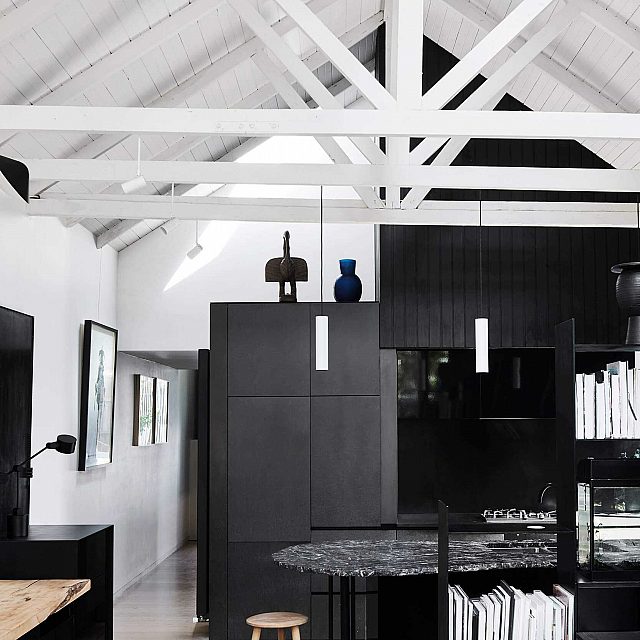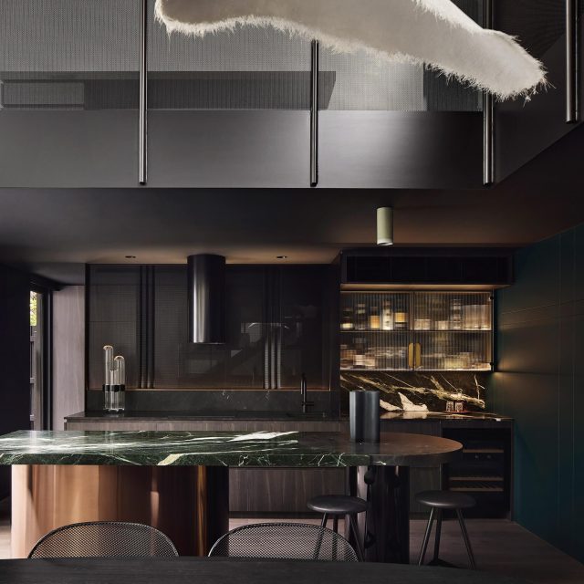
‘House In a Warehouse’ is a new dwelling in an old warehouse shell, designed to be a garden oasis.
Initially, the site was a 200 m² landlocked warehouse, built to all boundaries and entered via a new residential development, located in a dense urban setting.
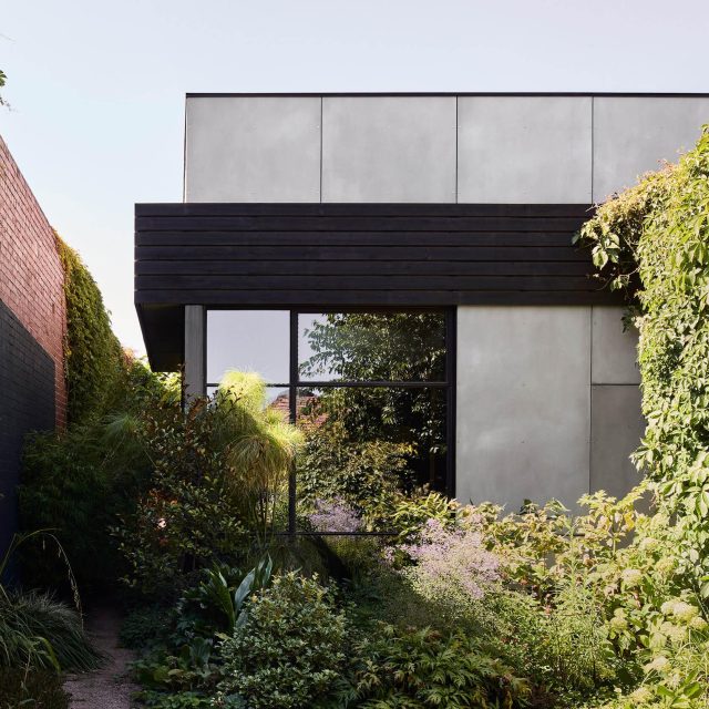
The driving concept is to create a ‘garden oasis’ within the confines of a building without existing outdoor space. The first response involves placing gardens across all four levels of the house connecting directly to internal spaces. The design solution allows the notion of ‘interior’ to extend beyond the infill, to the periphery of the warehouse walls, thus inviting the outside in. To add layers and maturity, the house also opens to surrounding neighbouring gardens beyond. This is made possible through a series of formal architectural decisions.
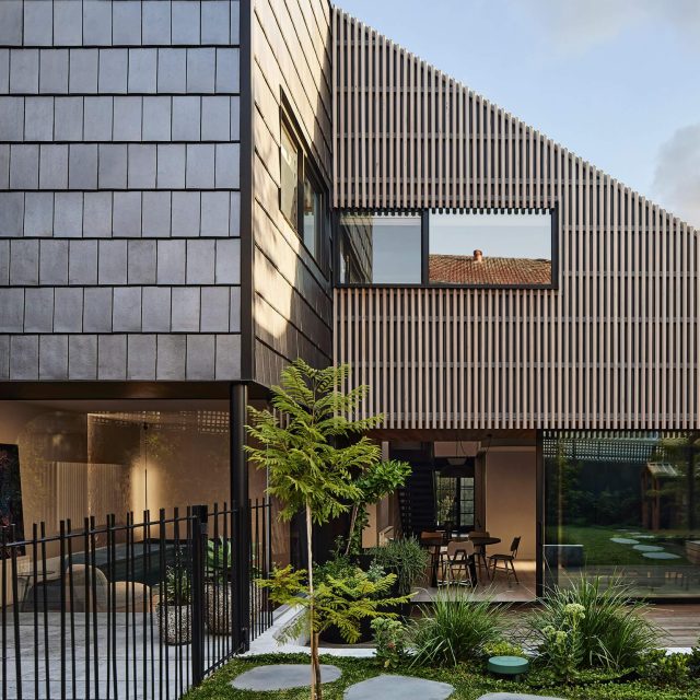
The house form steps back from the sawtooth shell, using the existing three-story wall to the south as one of its skins, for functional, aesthetic and sustainable purposes. Main living spaces on level 1, capture views, sun and neighbouring greenery, whilst the ground floor contains children’s bedrooms opening onto a safe private garden. Upper levels includes private spaces off the master bedroom and roof terraces for entertaining.
A layered system of screening splits the site, moderates and frames views allowing a feeling of openness and privacy. Over time, these screens will act as plant screens, encouraging foliage up and over the building.
A secondary concept embraces the remnants of a warehouse feel, by adapting and reinterpreting parts of the existing warehouse in a contemporary way. This subtly permeates the home across many scales. The aesthetic balances texture and warmth, combined with fresh finishes and connections with the old warehouse shell.
Many elements of the warehouse are reused both structurally and aesthetically employing more cost-effective design solutions. Additionally, much of the joinery is site built from existing beams and steel plates.
This house explores notions of re-use without looking ‘recycled’ and uses aspects of sustainability. It is designed to perform well passively, it contains integrated water and energy saving systems to minimises its impact on surrounding properties.
Back to Projects


