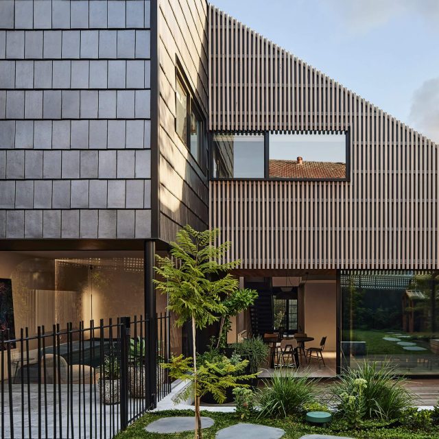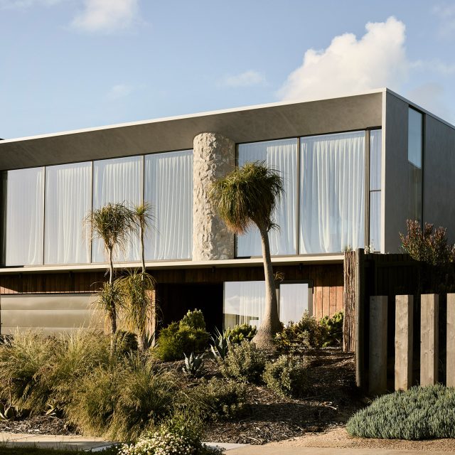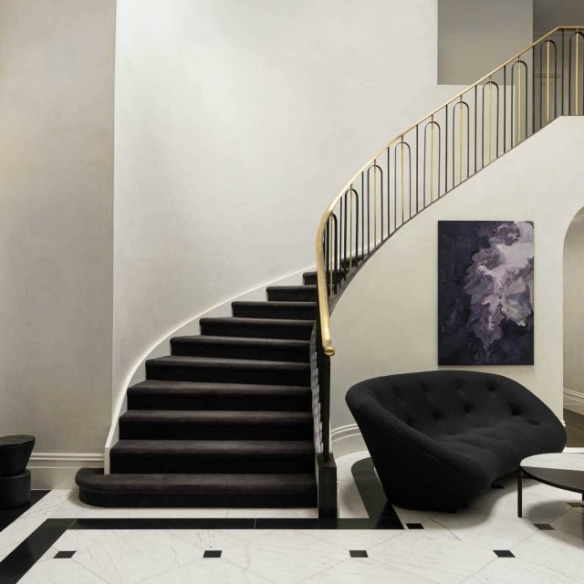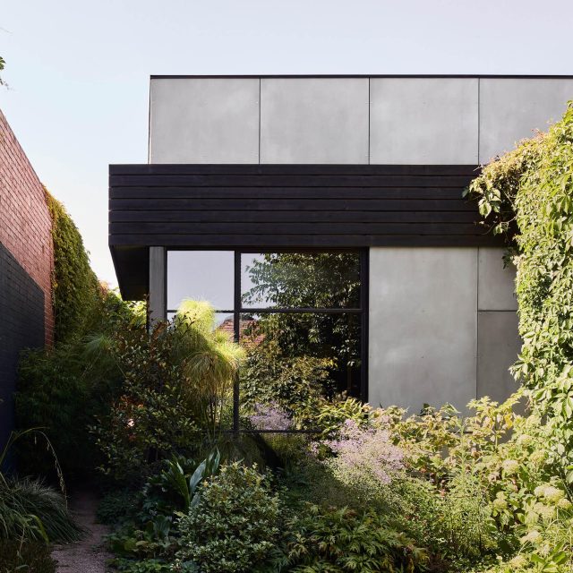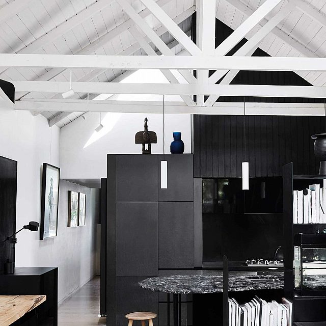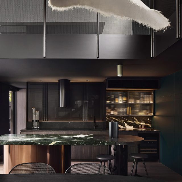
In its most recent incarnation, Three Stories North is an untraditional family home that embraces its layered history. Working with creative clients, the design approach is informed by their initial belief that beneath its previous renovations the building’s industrial heritage is quite unique. The project’s primary objective is to realise its existing potential rather than replace it with something entirely new.
The design is first and foremost a process of reduction to allow the character of the original building to be the primary feature. A key component of this is to retain and reveal the masonry construction giving the home an undeniable warehouse feel. Many original details such as arched doors and fireplaces are maintained in working order. Where possible the imperfection of the brick walls are celebrated as an indication of their history. At a few points glazing is used to fill gaps in the masonry to clearly delineate what is original and what is new. At the ground level, the original timber ceilings are also exposed.
Once two separate townhouses, the space is bisected by a masonry wall across all three stories which forms the axis for circulation. The levels are joined by a stair which hangs from this wall, inspired by an industrial fire stair. Dividing the plan perpendicularly, a central core forms a chimney-like feature which extends through a 9m high skylight while providing joinery elements to each of the spaces. Within the three-dimensional cross section, half of the house if zoned for public spaces, a quarter to more intimate spaces and the remaining quarter forms the dramatic void which connects the three stories and entry.
The considerable internal space is practically indiscernible from the unassuming traditional exterior. The entry is set back from the original façade creating an entry courtyard and allowing a 3‑storey glass façade to bring a substantial amount of light into the spaces as well as opening up to a large tree canopy in the streetscape. A large door is fashioned from 140-year-old timber joists repurposed from the demolition.
As a balance to the larger architectural spaces, the living spaces are much more intimate, characterised by subtle colours, texture and plush soft furnishings. Rough sawn timber lines the walls and recycled timber creates joinery adding warmth. Strong black detailing in the new areas create a distinctly modern contrast to the brickwork of the original building while linking to the industrial character.
Back to Projects


